Creative Brochure Ideas To Inspire Your Design
Brochures have always been one of the best marketing tools ever since the concept of marketing evolved. They hold the potential to communicate your business, products and services effectively to the target audience and convince them to prefer you over your competitors.
A brochure constitutes graphics and wordings arranged in harmony. Obviously the content written and the design elements have equal significance. They should complement each other and for that you need an expert team of intellectual copywriters and creative artists having expertise in all vital software such as Adobe Photoshop, Illustrator and Corel Draw.
When it come to the shapes and materials you use, try something creative with 3D shapes, cut-outs etc. like most of the professional companies in India do.
Your design should also consider the paper type that you are planning to use. It can be textured or embossed, with smooth or rough edges, matte paper or glossy and so on. An Indian company offering quality brochure design services make sure that all the factors are taken care of before the designing works actually starts.
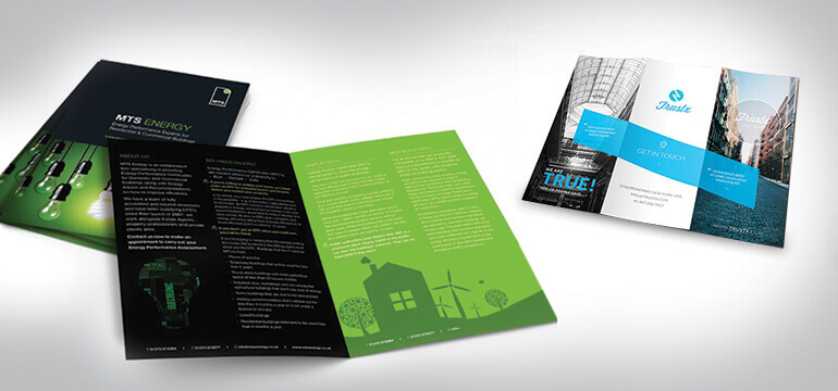
A crowded material will never allure the prospects; keeping it simple and clean is always recommended. Overdoing with graphics or text never helps and this is something creative people must understand. Designing something is not an opportunity to showcase your creative ability. It is actually about producing something that accurately caters to the specific requirements and expectations of the target audience.
Blending design and typography is a nice idea for any work. But simply using it may not bring to you the desired and expected results. There are certain elements on which you can use typography and identifying them is important. The company name, mission statement, caption and call to action etc. would be ideal. A mix of text and image can be visually appealing.
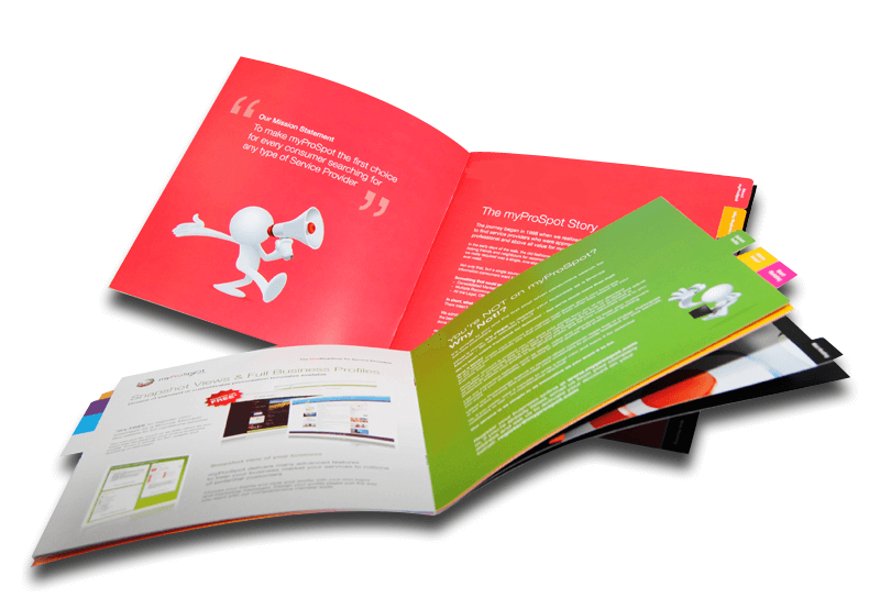
A heavy brochure with too many pages may turn off the readers. So, most of the companies in India that offer professional brochure design services keeps the brochure short and make sure to convey maximum information with minimum pages.
Before we end our discussion, we thought of sharing some really successful brochure design tips that would help you create presentations that would drive sales. Here we go:
-
Focus on simplicity
Designs that are simple design do not have to look boring necessarily. Some brochures having a combination of white background and simplistic fonts deliver exceptional outcomes in terms of responses.
-
Consider functionality
Surprise the audience through an appropriate use of functionality. Brochures that need to be packed with huge volumes of information should contain elements of surprise in order to generate interest among the potential customers. You may, for example, include surprises in the form of an additional page carrying a vibrant pattern, which satisfactorily complements the cover page. Small surprises may often have a bigger impact. Think about it!
-
Use simple shapes
You can add fun effects to brochures by making geographic shapes appear like callouts. Color pops appearing against the background can add a vibrant contrast and highlights the message better. The cut-outs also have a three-dimensional appearance and add addition elements of interest.
-
Follow a linear style
You need not necessarily create brochures in the form of booklets having a central binding. Your brochure may stretch out in all directions in various ways. You may not need your customers to flip through different pages, rather you can make them see your brochure as a whole.
-
Place inserts creatively
If you want to inert physical objects such as a dvd or a cd, you can make them a part of your brochure in a very interesting manner. Design a pocket inside your brochure to hold your objects properly. As soon as a customer opens your brochure, the cd pops out, encouraging the customer to buy it. The object holder’s shape adds a dimension to the holder, which would otherwise appear flat.
-
Use diverse shapes
Brochure pages may not be rectangular or square all the time. The pages of your brochure may have different shapes such as triangles, circles, triangles, heart, or any shape that best demonstrates your brand’s character. When different shapes fold over each other, an interesting action gets generated, encouraging the user to discover what lies underneath.
In case if you encounter any dilemma while brochure creation or you want some suggestion on how to create something awesome, contact us. Our graphic design team is always ready to render professional support to help you create an exceptional branding portfolio.
These were a few tips for sales in brochure design and we hope that they would bring you great results. Well! Reading our blog would be a worthy investment of time, especially if you are into designing or in any way associated with the same.

