15 Tips to Market Your Sales Brochure Design
When it comes to sales, brochures are crucial and very valuable. Effective brochure design holds the potential to persuade the prospects and make them buy from you. So, you must make it informative, relevant, impactful, interesting and memorable. There are certain brochure design tips for sale professionals that you must be acquainted of if you want the advertising material to perform as per your expectations.
When talking about good brochure design, what essentially matters is the clarity and conciseness with which you can communicate your business’s purpose and how it adds more value to customers’ lives. A product brochure shabbily designed would distract prospective customers and drive them to your adversaries.
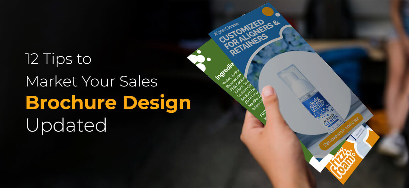
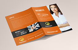
Before learning how to make a good brochure, you need to understand the way information is organized within its body. Brochure is in the form of a leaflet containing a single sheet. The sheet is typically folded in bi, tri, c or z form depending upon the way information flow for your company, event, campaign, service or product that has been designed.
Design as per the relevance

Design as per the relevance The brochures intended for distribution need to be designed in shapes which can communicate information properly in visually attractive manner to targeted audiences. Further, designs which resemble the conventional paper brochure can be given digital makeover by utilizing the advanced features of PDF interactively.
One of the important marketing brochure design tips is to keep the shape and format of brochure meant for distributing to public on the go suitable for putting in bag or pocket. Postcard sized brochure or one that can be tri-folded is ideal.
Brochures which have to be distributed to stakeholders, financers, or business partners can have a number of pages or might be published in bigger size to give space to all your business plans.
When considering appropriate advertising brochure design ideas, it is vital to factor in the age of your targeted audiences. Younger audiences have to be catered to with sleek, stylish and glossy brochures with eye catching illustrations. Older prospects would care more about information rather than overall look.
Never Ignore Your Audience

Never Ignore Your Audience You should highlight most motivating and relevant information in your brochure shrewdly. Tell your readers how your provision offers a solution or solves a problem, if it does. Headlines can be used for conveying this message in a strong manner; bold graphics also help. You can also make use of brochure design elements for bullets, italics and similar formatting to let the readers easily notice and understand the significant points.
Make the material reflect your brand

Make the material reflect your brand An ideal design should echo your brand and its key values in every possible way, not merely through style and colours. Whether the underlying nature is fun, youth, professional, trusted or anything, the genuineness should be properly established. To say, if your purpose is humanitarian or philanthropic in nature, the material should be invoking emotional response and use moving images without any promotions. This is mandatory for best sales brochure design.
Impact should be used as design element

Impact should be used as design element In case of direct mails, you should have a reason for opening it. Contrary to this, a sales booklet or a brochure should have something to make you remember it. So, make sure that you create an impact by using purposefully decided elements including images and cleverly device text. It should in fact convey a message to the reader that you have the solution or answer addressing to their need or queries. Most professional brochure design companies use this tactic in a prudent way.
There should be proper organization

There should be proper organization The brochure should be equally operative whether it is used as a as a leave behind material or a tool for pitching. So, different elements such as messaging and art must be organized effectively and appropriately. This is important to ensure that the reader is able to navigate through the content easily and can quickly find what he needs. Also with planned arrangements, people remember what you offer and there is more chance for them to contact you to avail further information and details. Aesthetics and structure must be delivered; this is one of the basic sales brochure design ideas. Every design element should be reasonable and must have a purpose to serve.
Brief and focused tagline

Brochure tagline design The success of any relationship works based on how well we communicate. Brochures are on the foremost front while we consider communicating in a business. If you are in any way associated with a business, let it be online or offline, you know how effective brochures in marketing are. We have listed out several factors to take care of to make your marketing material win the audiences.
- Be 'silver-tongued'- communicate effectively, clarify your strategies and principles
- Don’t make it well said, instead well understood – the content must be precise and to the point. Make it readable and legible.
- Attract attention– our brain notices images at a greater speed and hence they can snatch attention easily.
- Adding a relevant photo could add to the prettiness of the material along with speaking about your business motive indirectly
It’s very important to know how to design a good sales brochure in photoshop. We believe the tried and tested sales brochure ideas listed in this article will surely help beginners enrich their brochure designing skills.
Practically creative design

Creative marketing brochure Different types of brochure designs are in use nowadays. Choose a design suitable for your product. Stick to 'minimalism'- throw away unnecessary rudiments and focus on what must be there. Ensure the quality of both print and paper. Make your advertising material easily displayed on a brochure counter. Mostly, Tri-fold or bi-fold brochure deigns are suggested. We have an expert designers’ team who could definitely incorporate the best and most customized creative brochure design.
Check out further successful business brochure design tips for more details.
-
Use colours that are right not bright

Use colours that are right not bright This is one of the most significant brochure designing tips.
Colour is something very critical; it’s not merely a component for brand recognition. Every colour carries with it a specific emotion and hence it should be used intentionally and wisely. They should complement your value and brand. You must know at least the basics of colour theory. The emotion and message red conveys is poles apart from what blue signals. So, before finalizing color combinations for brochures think carefully. Doing wrong with colors can ruin entire thing; it may create a negative first impression which is really damaging.
Wise choice of typography

Typography font selection Fonts are not merely meant for embellishing the material. Making the brochures legible and implicit should be the focus. Multiple font faces can create ambiguity, yet 2 or 3 fonts can be used if required. Choosing the best font for brochure design depending on the printing material and technique is also a crucial aspect. Our experts can help you to sort the best font for your brochure text as well.
Showcase your creativity and originality

Showcase your creativity and originality In order to make heads turn and grab attention of prospects, your brochure design needs to be creative. In the present era, creativity has been taken to next level by motivated designers who keep coming up with unique ideas. Hence, one of the effective brochure design tips is to maintain originality and distinctiveness in alignment with your brand’s vision. Your brochure should be identifiable even among a stack of other brochures with its visually appealing design. Brand identity is largely dependent on your presentation of information uniquely through brochures.
Make Your Call-To-Action Really Actionable

Make Your Call-To-Action Really Actionable If you browse through effective brochure examples, you would find that they all have strong call-to-action. A brochure’s purpose would be defeated if you fail to tell readers what they should do after going through published content. You need to tell audiences about the action you seek from them. You may ask them to visit a place to participate in some event, or get in touch with you over phone or email or simply anything, it should be clearly stated. The theme should be consistent all along. If your brochure has multiple pages or folds, the call-to-action must be repeated.
Always use best quality publishing paper

Always use best quality publishing paper The one common factor among different product brochure design types is the quality of paper being used for publishing. Thin, easily crumbling, non-glossy or other poor textured paper often conveys negative impression about your brand. To enhance the appeal of business brochure design particularly, superior paper quality is a must to inspire trust among readers. You may have to spend more but prospects would feel that you more are conscious about serving customers in better manner.
Use AIDA planning for your brochure design
AIDA stands for attention, interest, desire, and action. These are the stages in a sales funnel that guide potential buyers throughout the customer journey. Your sales brochure must have these aspects in it to be effective. Consider AIDA as your goal while designing it; your brochure must first attract the audience's attention. Thereafter, it must be interesting for them to read it until the last page
The content must tap into their desire to take the final action of making a purchase, visiting your website, or requesting a callback. This should be the linear flow of your brochure or flyer design. Planning the design based on the AIDA approach gives a purpose to the sales and marketing brochure that must never be overlooked.
Give more emphasis to benefit-oriented headlines
The first and foremost purpose of your product or service advertising brochure is to grab the audience's attention. That is only possible with captivating headlines that clearly convey the benefits and grab their attention. Onlookers must easily understand how your product or service will solve their pain points and add value to their business by just skimming through the headlines of the brochure. It must be an easy and engaging read for them.
Only the crux of the matter should be communicated through the benefits-centric headlines. Further details can be explained within the inside copy; the headlines will prepare the audience for that.
Experiment with different layouts to refine the design
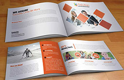
There are myriads of brochure layouts and folds to play around with, such as bi-fold, tri-fold, cross-fold, gate-fold, Z-fold, and more. Try out all of them for better reach. You can also do A/B testing between more than two layout styles to test the effectiveness of your sales brochure.
Different brochure folds serve different purposes, but each has its own distinct look and feel that gives a brochure design its individuality. Besides, if the designs appear to be similar in every marketing campaign, there's a high chance your audience will find them boring. To tickle their visual senses and make your marketing ads and campaigns all the more beneficial, incorporate different layouts and folds in the brochure design.
This is one of the best ways to make a marketing brochure or flyer effective and visually engaging.
Conclusion
Hope by now you have got a fair understanding of what makes a good brochure design. Sales brochure design may seem daunting at first. But with enough practice and proper techniques, one can design the best sales collateral that clearly depicts a company’s service offerings. The 15 valuable tips mentioned in this article will certainly give a headstart to a beginner. Most of these tips are recommended by professionals in the graphic design industry.
So if you are a novice wanting to design the best sales brochure, follow the tips above. Keep practicing diligently and hone your skills. And in case you find it hard to manage it all by yourself, seek professional assistance. Contact a professional brochure design services provider and offload some of your tasks to their experts. These prolific graphic designers assure the best quality with a fast turnaround time, making your brochure marketing strategy foolproof and profit-making.


