Some Exceptionally Operative Tips for Using InDesign for Typesetting

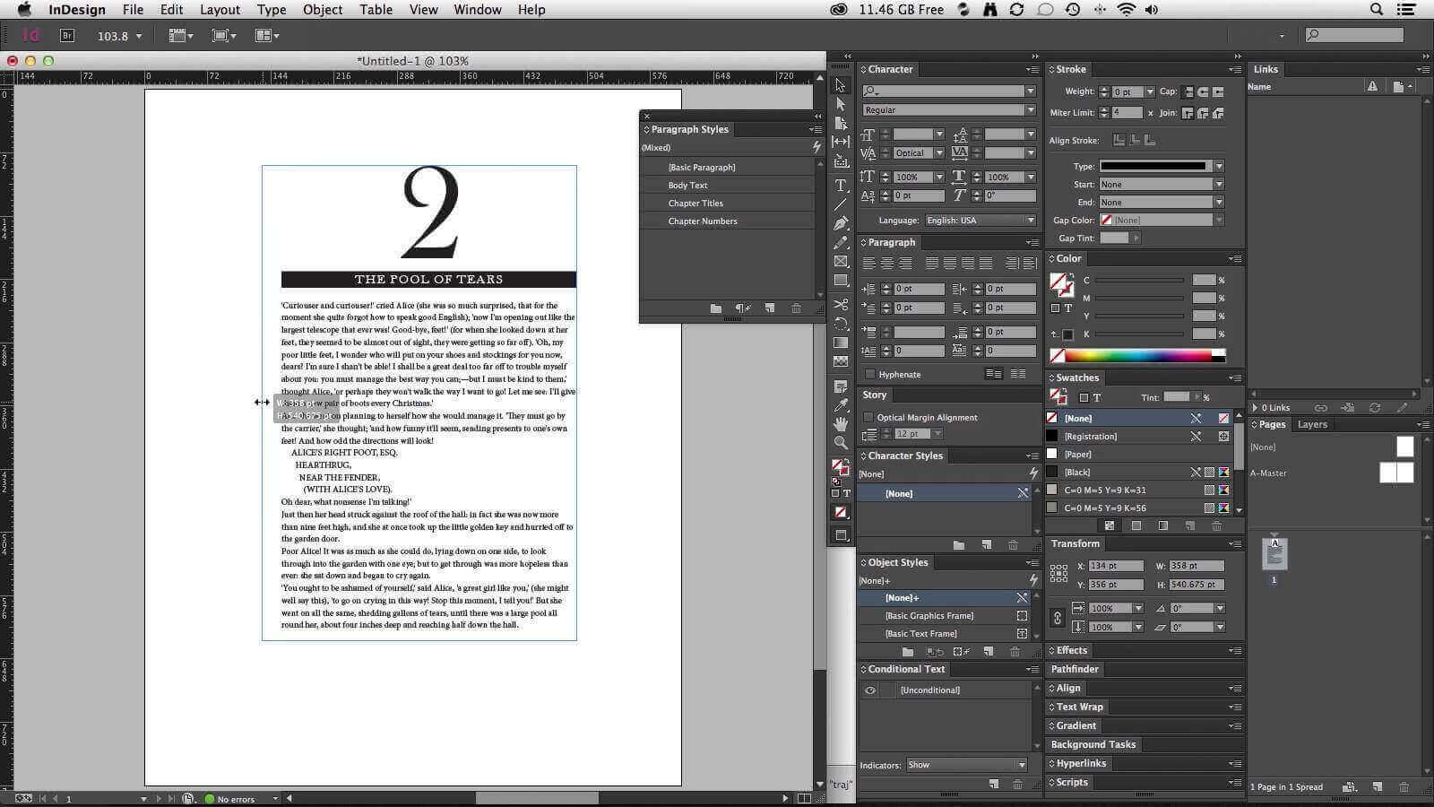
InDesign is highly feature-rich and standard software of Adobe Inc. that is used for typesetting by most of the companies offering book typesetting services. The favouritism of this software is mainly because of the seamless flexibility it offers and user-friendliness when it comes to book layouting. In this blog, you can grasp some InDesign typesetting tips that help you to make the most of this amazing tool.
-
Optical benefits
With the optical kerning settings, Kerning, as well as the spacing between all the character pairs, can be automatically determined. This helps immensely in case if you have restricted font sets to work with. This can also be used when the overall spacing looks in a document are uneven and weird. Try highlighting the text area, and experimenting with character palette settings would bring in some favour. This is one of the most common steps that a typical the book typesetting company follow.
-
Add manuals
You will realize the helpfulness of optical kerning while merging different fonts, type sizes or weights where kern pairs are absent in Metrics setting. Bold display areas like headlines need careful kerning. In fonts like sans serif, a tight setting enables to comprehend small features more easily. The impact of words can be enhanced with tighter kerning. Regardless of the settings, it is always possible for adding manual Kerns.
-
Nonbreaking spaces
The Control Panel Flyout menu has the No Break option that ties the words that have to stay linked together in the flowing copy. You can use the Nonbreaking Space as a good option (Ctrl / Cmd + Alt + X). You will find this option under the Include White Space sub-menu, inside the Type menu. This operates characters which are hidden, unlike the No Break option, which makes it easier to spot while editing text in future.
-
Copy flow
Adobe Paragraph & Single Line Composer and be used alternatively, in order to maintain copy flow. In Single-line Composer, the hyphenation and spacing are controlled each line after line. These changes are made by the Paragraph according to the needs. The length of the copy determines the best way to choose. The said are in fact fundamentals of typesetting.
-
Grid alignment
Another one among InDesign typography tips is pertaining to grid alignment. The users tend to align the flowing body to the grid at the baseline, which keeps it consistent all over the magazine. In case you want to add copy breaking this grid, like caption or boxout, the Only Align First Line to Grid option will turn out to be useful. The entire paragraph has to be aligned to the baseline grid in order to incorporate it. Then the Align Only First Line to Grid option has to be selected from the Cpanel menu.
-
Vertical alignment
At times, punctuation causes the spacing to be uncomfortable. In these cases, you can use the Optical Margin Alignment option, which is found under the ‘Story’ option under the ‘Type’ menu. It adjusts the position of the punctuation, with regard to the position. The punctuations get shifted to the gutter. The overhanging characters also get adjusted. It is necessary to experiment with the size of the point and get the desired look in the text. This can be applied to each paragraph. In the Control panel menu, you will find the Ignore Optical margin option, through which you can turn it on and off.
-
Paragraph breaks
Copy flow can be controlled through the Keep Options functions, which you will find in the Cpanel option of this professional typesetting software. In order to keep the subheadings attached to the body of the copy, you can use the Next Line feature. The required no. of lines required to be entered, in order to link text field. As a result, the paragraph will get pushed to the next page or column, if necessary.
-
Flow and breaks
Another important on among various InDesign typesetting tips is that you can go to the Insert Break Character option under the ‘Type’ menu, which serves as an alternative way in controlling the breaks and flow in the copy. The options here are the same as the ones in ‘Start paragraph’ under ‘Keep Options’, however, you will not be able to apply them to the paragraph styles.
-
Be alert of ligatures
Proper care must be there when it comes to kerning ligatures and this is what most of the top typesetting companies offering professional services advice. In case if the Kern seems too tight, InDesign will spontaneously relapse both discretionary and typical ligatures to separate glyphs. This can be a problem in typesetting when after manually kerning a headline, a style has been applied to it. So, before kerning ligatures manually, ensure that the inclusive tracking of style, as well as kerning, is set well in advance.
To conclude, Adobe InDesign is the standard publishing software and a favorite of all typesetting professionals worldwide. The reason behind InDesign’s growing popularity is the sheer number of great features and tools the software offers to design the inner pages of a book flawlessly. Hope this quick tutorial has taught you the basics of designing a book and, most importantly, how to get your typesetting process right.
Let us know if you are interested in more such informative articles to speed up your workflow; we would be more than happy to share the knowledge. Our prolific team of typesetters can impart their expertise through these tutorial content. Stay tuned for our next publication. Until then, keep your readers glued to your book with fabulous typesetting! All the best!


