Common typesetting mistakes you should avoid
As word processors are gaining more and more popularity at a rapid pace, many technical authors are typesetting their work. However, the unfortunate fact is that most of the authors are even not acquainted with the basic principles associated with it and hence they do many typesetting mistakes. Detailed below are some of the very common mistakes done.
-
Not considering type-size

A line of 66-character is considered suitable for readability. Type and line size details are to be scrutinized very well as the best one for your purpose depends on many factors about which you must be aware of. So, it is something relative about which serious consideration has to be done. This is very crucial in technical document typesetting. An important aspect that must be considered while choosing the font size is the eyesight, reading capabilities and the perception level of your audience. If the printouts are to be delivered to an old age home then it is not required to do it in 8” or 7” size. Size selections play an important part and hence wisely choose the font size to cater to the needs of your audience. Don’t over or under stretch letters. The practical aspect of reading is lost if the letters are too tight or loose. The purpose of writing a document is not to fill in the specified space or paper in a printouts case but to deliver the content to a targeted group. In doing so it is imperative to focus on not losing the grip between words. Expert companies offering book typesetting services master this. One of the easiest ways to avoid typesetting errors is to avoid using too many fonts. Limit the number of fonts to two or three, which will deliver a coherent and consistent look to your book.
-
Line length overkill
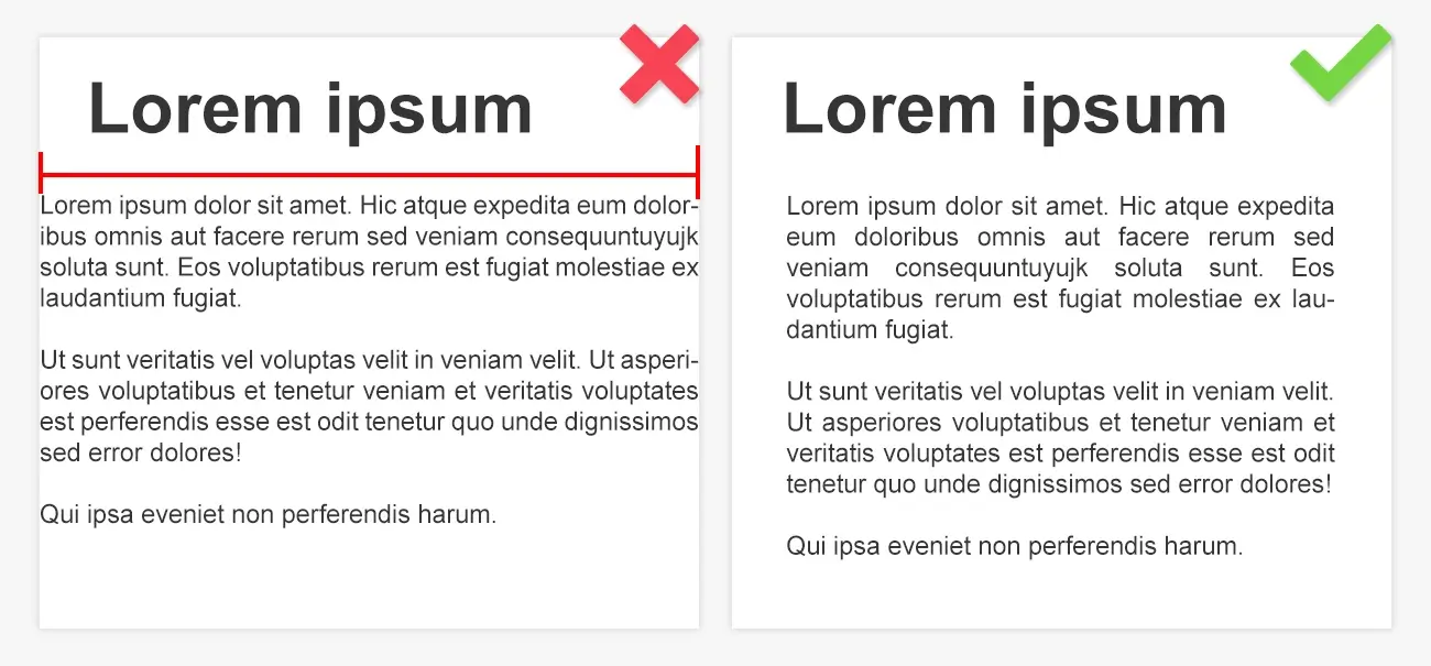
Another complaint readers often come up with is unjustified lengths of lines. Every reader wants to have a comfortable and effortless reading experience, and if the lines are lengthy, the reading experience will be adversely affected. Not only that, it will also prove to be confusing to the readers. If you take cues from veterans—like newspapers and magazines—it is better to have a maximum of 75 characters in your title. While there are no hard and fast typesetting rules for publishing saying you must adhere to such a number, if the title runs over two lines, this unsaid rule will help you what to do.
-
Senseless usage of mono-space fonts

When you use Courier typeface or others that have restrictions owing to mechanical constraints from typewriters, alphabet “I” is made to be in the same width as that of ‘’W”. In case if you want to get a feel that the work was produced from a typewriter, using Courier is fine but if attractiveness and consistency are your primary concerns go for any proportional font; only this will help. Font is the most important element to consider while we are modifying type. Terribly decorated fonts can completely spoil the authentic look of your message. Contents are meant to be read out not expressed. This must be kept in mind while setting fonts.
-
Making the headings unpleasantly huge
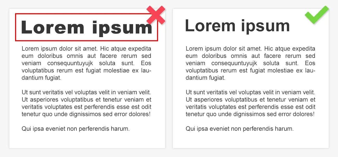
Headings should be distinguishable; most typesetting companies in India recommend the same. In normal cases, heads are found in margins or at set off using spaces. In such cases, there is no need to make the size of head more than body type. In most circumstances, another font family need not be used though there can be exceptions.
-
Imperfectly indicating importance
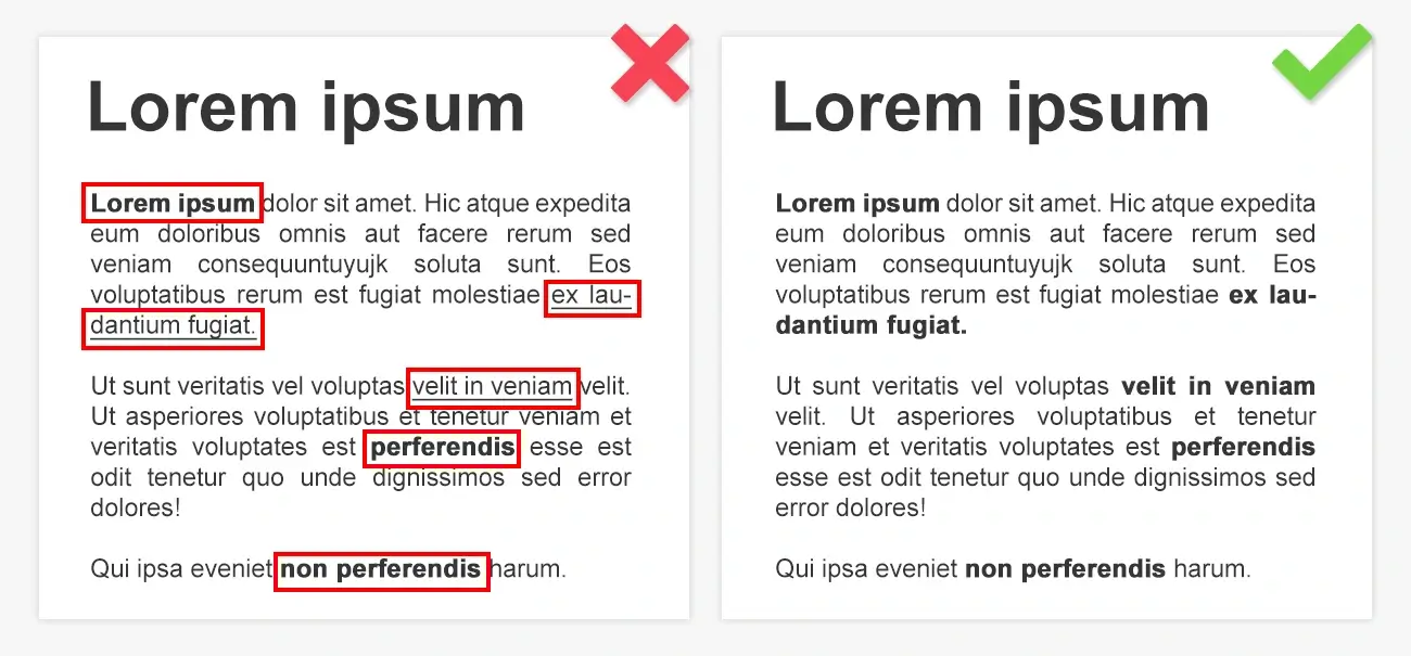
You should not underline. It’s something solely for typewriters. In modern programs like Word Processors, italic typefaces can be used. Using bold makes your page appear blotchy. Quotation marks should be used only if it has the specific purpose to serve.
-
Lacking control over the breaks
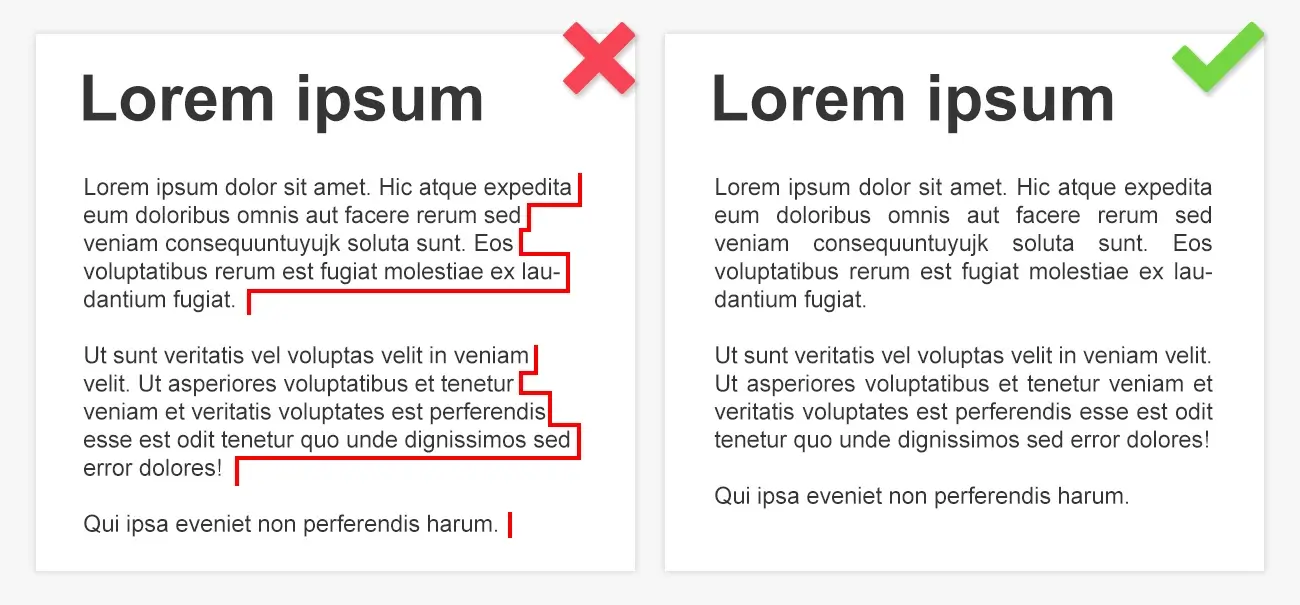
You should have proper control over both line breaks as well as hyphenation. Adjacent elements can be prevented from getting separated by a page break or line by using non-breaking spaces. Non-breaking hyphen avoids compound modifier’s different elements.
-
Failing to distinguish paragraphs clearly
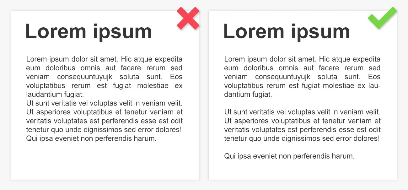
Making the paragraphs clearly distinguishable is very important as failing to do so adversely impacts readability. There are two methods by which paragraphs can be identified. You can indent the very first line of all paragraphs. Else make use of paragraph formatting like separating paragraphs by something that serves similar to a blank line.
-
Mismatch in alignment
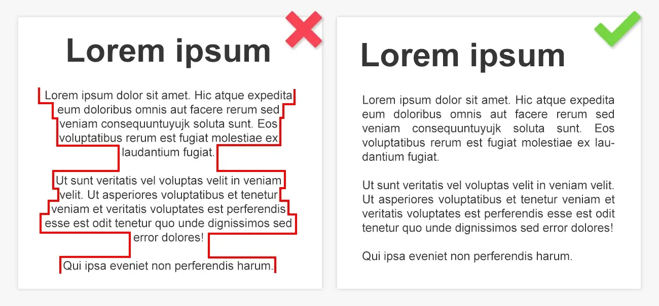
It is important to maintain a consistency in the format of the book. Make sure that the alignment in the book is maintained. You may seek professional help from the experts and follow the typesetting rules for publishing. In most of the word processing tools, you will find four alignment options. These are right aligned, left aligned, Justified and Centered. You should also focus on the alignment of the last line in a paragraph. Using multiple settings of alignment in the book will make it look unprofessional. Turn on the hyphenation and use Justified alignment. This will allow you to deal with the inconsistency in spacing in the middle of the lines. You can avoid typesetting mistakes when you maintain the alignment.
-
Ignoring hierarchy
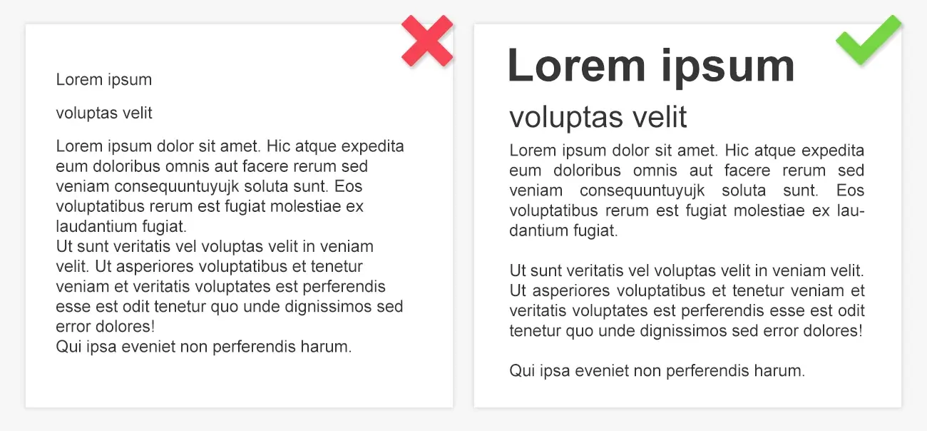
When you publish a book, you should have a detailed knowledge of the fundamentals of typesetting. In typography, hierarchy is used to establish the degree of importance of various textual elements. In case you miss out any hierarchy or use them inconsistently, it will lead to confusion among the readers. It will become difficult for them to understand where to begin with.
It is used in typography to denote the order of importance of various textual components in a book. It is important to use the appropriate font size in typography, along with the style of text in your manuscript.
-
Using double space at the end of sentences
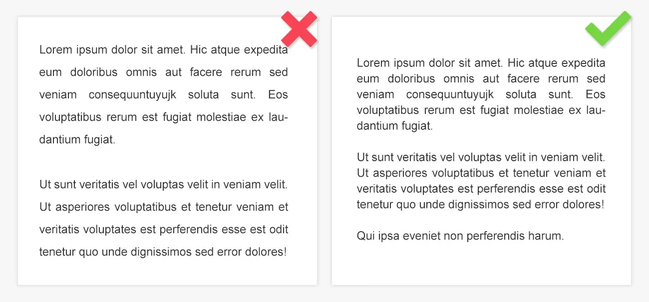
The term sentence spacing is used by typographers to denote the horizontal space between two subsequent sentences. People often argue about whether they should use one space or two. It is recommended to use single spacing in these cases, as it does not have any negative effect on the book. It is an established norm in the industry and you should remove double spacing between the sentences in your manuscript. In case of long books, this strategy will help you to reduce the total page count. Get a suitable bbook typesetting software, that comes with all the advanced features. This will ease up the typesetting process to a great extent.
-
Space after full stop

It has become a common and glaring error in the recent past to leave two spaces after a full stop. While this is not an error caused by the designer, it can cause issues during the production process, nonetheless. The error of two-space after the period is a product of typewriting days and it was then used to avoid placing the following character too adjacent to the period. However, most of the modern typewriting programs, web browsers and desktop publishing tools try to get rid of this error. As one of the basic typesetting rules, this will, without any doubt, help the designers to be safe from the inefficient practices of the old times.
-
Turning off guides and margins
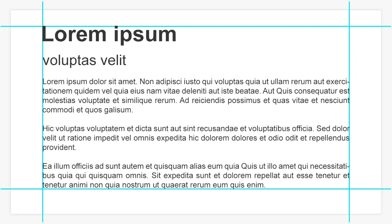
Every reader wants a level of uniformity and framework to make the process of their reading convenient; and it is the job of margins and guides to bring in all the text you type to a certain framework. As such, it is really important that whatever design software program that you use, the guides and margins must be turned on while typesetting. Most of the programs available in the market take care of the alignment of the document thus saving you from all the troubles you might otherwise have to endure. This is definitely one of the more effective typesetting tips that can elevate the overall reading experience of the readers.
-
Inadequate orientation of figures and elements
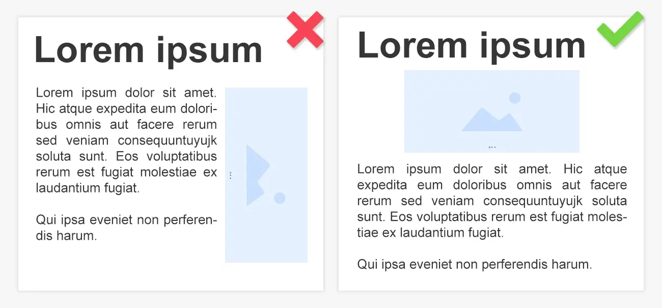
Texts and figures should be similarly oriented and this is what most of the professional digital prepress companies providing book typesetting services unfailingly do. This is vital to assure good reading experience or else the reader will have to keep on rotating the document now and then. This should not happen. Also read more about professional typesetting tips. Newer age specialist service providers focus a lot on inserting pictures and video clips to emphasize the topic but in doing so they are actually overdoing it. Orientation plays an important role, as the content which is inserted must be properly adapted to match the text. If so, that will increase the reading pleasure.
-
Insufficient contrast
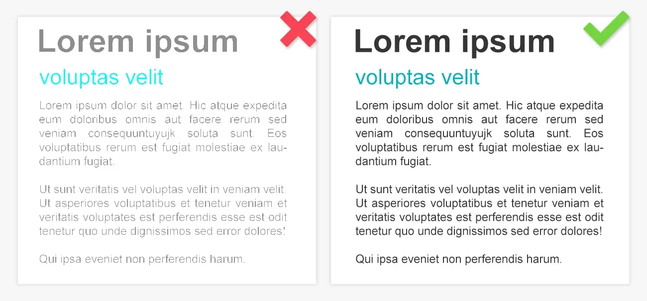
It is important that when you create a copy, the text must have adequate contrast against the background so that it becomes easier for the reader to look at the same without any readability issues. Since no reader wants to make an effort to figure out the words written on a copy, adequate contrast must be set. This issue can be addressed by ensuring that you can read your text without making extra efforts to do so. While you may not find this in any of the typesetting guidelines, it is just as important as any other tips to make your copy readable effortlessly.
Typesetting errors may cause a real blunder and may ultimately impact the reading experience. This may impact your repute as well. Reputed typesetters would allow you to adhere to typesetting guidelines and international typesetting standards, which would allow you to create a book that can impress the global audience.
MAPSystems provides professional typesetting services that exceed customer expectations. Making use of sophisticated technologies and with the right people on the floor, our services can be of help for all types of technical authors. If you have any project to discuss, get in touch with our team. We will see how you can be benefited with our humble skill sets.

